Social Media to you is?
- 27 May - 02 Jun, 2023
Branding a city is not as easy as it seems. One needs to be aware of the heritage, culture, people and traditions of the city which is to be branded. Contemporary times have changed how big or small cities around the globe promote their lifestyles and culture wherein a city’s logo tends to play a huge role.
Keeping in mind the distinct identity of each city, a dedicated brand logo gives it a sense of purpose and adds the much-needed soul to it. Designers, therefore, have a daunting job to perform with one image which not only represents their work but the city they reside in. Following are the six most compelling logos that speak volumes about the cities they symbolise.
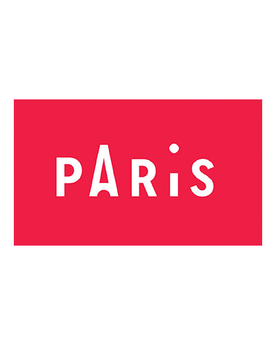
This new identity and logo was done for the Paris Convention and Visitors Bureau by Graphéine, which introduced the city’s revamped identity. This logo’s typography, which although, could have been much more interesting isn’t too bad to start with. The logo is Eiffel-Tower-esque yet minimal in terms of its design. It is certainly one of the best destination logos to have been created in recent times, as it is location specific, perfectly crafted and meaningful, all at the same time.
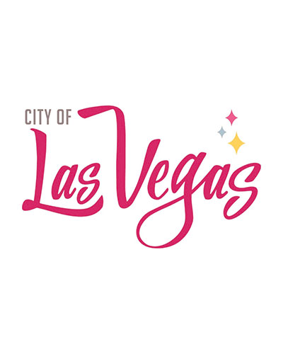
‘What happens in Vegas stays in Vegas’ has sold the city for more than a decade. Known as the city that never sleeps no way contradicts the true essence if this fun-loving metropolitan. However, while keeping it different from the logo specifically made for the Las Vegas Convention and Visitors Authority, the government of City of Las Vegas has come up with a rather lively logo to represent their city’s vibrant experience. For visual identity, the font Big Noodle Titling has been used to mention the ‘CITY OF’ following its clarity and neatness, giving it a rather industrial feel with a progressive, modern flair which appears timeless. However, for ‘Las Vegas’, the font Stay High has been used. Each letter has been transformed to embody the style and mood of this entertaining city, giving it a much-needed flow and vintage feel with its hand-lettered type – an interesting combination of contemporary and classic, which defines the city perfectly.
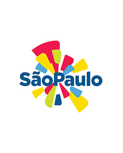
The logo of Sao Paulo is designed to appear inviting, bright and clear without looking too basic. It was designed in anticipation of both, the Brazil World Cup in 2014 and Olympics 2016 in Rio de Janeiro, the logo designer Rômulo Castilho had to create a logo thatwould not just promote the city as a distinctive destination full of culture, services and opportunities, but also its welcoming people. The individuality of the city is perfectly captured in the colourful logo, which evokes the famous Brazilian carnival vibe.
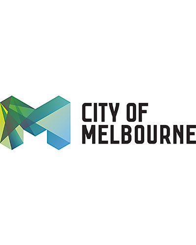
Design firm Landor was assigned with the task to rebrand this Australian city’s image in the year 2009 for the first time ever since 1990s. The company had certain objectives in mind, like advertising the metropolitan’s sophistication around the world and producing a logo that would remain contemporary for many years to come. They captured the essence of this city in two beautiful ways: the diverse use of shades and colours in the logo to represent the city, and also linked and overlapped polygons which made the city’s symbolic ‘M’ stand out and speak for the city itself. Together, the logo sports a modern and fun vibe that can convince anyone to visit the city at least once in their lifetime.
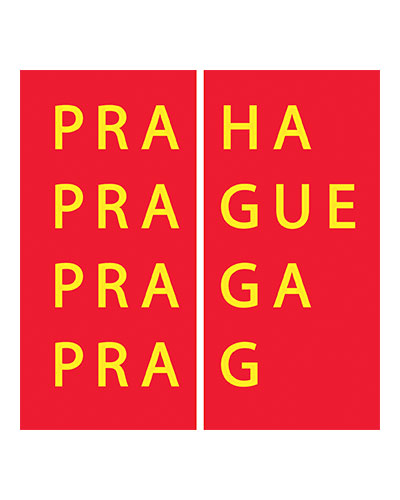
The city isn’t just a treat for the fans of gothic architecture, but is also a contemporary hub for those who want to experience the gifts of modern times. The city’s logo focuses on the multilingual aspects using Prague/Praha/Praga/Prag in the design; this basic visual element provides amazing potential with a flexible system of identity. Made by design firm Studio Najbrt in 2002, the main aim of this new logo was to offer “a symbolic hand extended to all visitors coming to Prague and a reminder of the city’s history as a center of different cultures and nationalities.” For which, they have channelled the scheme of the city’s flag’s colour, in addition to featuring different variations of Prague in terms of its name spelt in different languages, which reflects the capital of Czech Republic and its diverse population.
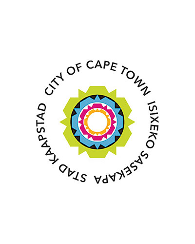
Jointly designed by King James and Yellowwood in 2014, Cape Town’s logo shares the mission to represents the city’s forward-looking frame of mind in a visually appealing way. Keeping in mind the megapolis’ motto, “Making Progress Possible. Together”, which led the branding agencies to look towards the horizon, in a literal sense, and find inspiration in its most popular landmark – Table Mountain. The landmark’s silhouette became the basis of the new logo, repeated and linked to form a circle, while the extra concentric loops were made to convey the city’s message of being “layered and harmonious,” while the bright colours encapsulate the energy of the cosmopolitan’s culture.


COMMENTS